We’ve recently updated our block headers for a more simplified look. This article is designed to outline all the new behaviors.

Introducing the Formula icon for hiding the formula bar!
There is now an formula icon that can be used to hide and show the formula bar. Members can click the new formula icon to expand and collapse the formula bar.
Also when using the drilldown options, Members can click on “Show/Hide formula breakdown” to expand and collapse the formula bar.
We optimised the experience for each type of user. If the Member is considered a “modeller” (either have the ‘Can Configure Block’ or the ‘Can Open Block Explorer’) then the formula and the formula breakdown will be displayed by default. All remaining Members will be considered as “contributors” and the formula and formula breakdown won’t be displayed by default. All users have the ability to show/hide formulas.
Block Header Changes:
-
New options in block menu: A new option menu now appears in the top right. This menu includes the following buttons: Add to Favorites, Download Data, Dependency Diagram, Impersonate, Settings, and Delete Block options. This change has been made to enhance the overall interface.
-
Import data: Import data will now appear as an option directly in the headers. The download data option has been moved into the menu.
-
New Pivoting Icon : The pivoting icon has been updated to a new design.
-
List Configuration now Properties: The "Configure" button for lists has been replaced with "Properties." This is where you can add new properties and adjust the view of your list by reordering list properties, adding group properties, or adding properties for page selectors.
-
Access Rights Display Chip Icon: The display chip icon for access rights has been reduced in size to show only the icon. Hover over the icon to view full information. When expanding from a Board, the icon is located in the top right, next to the block's name. When the block is open, you can find it on the left near the name. For all blocks, hover over the icon for more details. For Members considered as “contributors”, they will only see the “No access” icon and no longer see Full or Partial access.
-
Go to Block from expanded widget: To "Go to Block" when expanding a board widget, click on the icon in the top right to open the Block. It features the name of the block, access rights display chip, and an icon indicating the type of block (red for tables, purple for metrics, blue for dimension lists, and green for transactions list).
-
Drill Down: When using the drilldown options, the formula will be hidden by default for those without permission to create formulas and shown for those who can create them. Members can click the new formula icon to expand and collapse the formula bar.
-
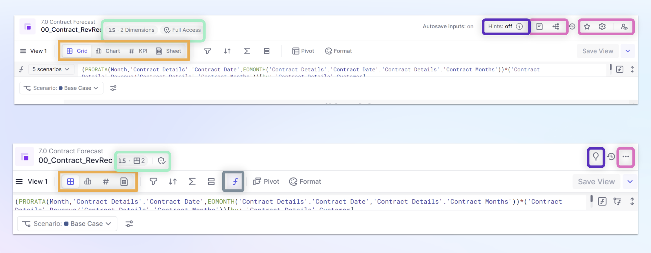
New Visual for Metric Structure and Data Type: The data type and the number of dimensions have been condensed for a cleaner look. Hover your mouse over the icon to see more information.
-
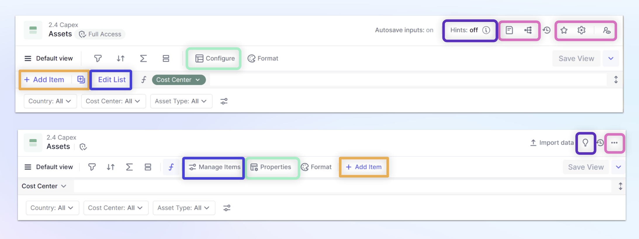
List Editing: For lists, the "Edit List" option has been moved to the bar above and renamed "Manage Items." We have also adjusted the delete list behavior. Now, when you select items in a list, you will see a "Delete" button located at the bottom.
-
Visual Hints: Visual hints will not be displayed with a lightbulb icon in blocks. We have removed the option for breakdown. Cells with a gray background now indicate a breakdown or auto-generated Dimension or Transactions list ID.
-
Autosave Icon: The autosave status will not be visible unless autosave functionality is disabled. In such cases, you will see the status Autosave inputs : off.
Who doesn’t love a good before and after photo, here are some from directly in a Block
List changes

The relocation of the "Add Items" function is now highlighted in orange, the Configure icon has been renamed as "Properties," indicated in green. Here you can see the new lightbulb icon, replacing the previous "Hints Off" function, and this change is highlighted in purple. The different options that were previously located in the header have been integrated into the new block menu, shown in pink.
Metric changes

The new way of displaying Metric structure and data type is highlighted in green. The Display mode icons have had their wording reduced, this is highlighted in Orange. The new formula bar icon is highlighted in gray, this icon was not in the previous header. The different options that were previously located in the header have been integrated into the new block menu, shown in pink. The new lightbulb icon, replacing the previous "Hints Off" function, and this change is highlighted in purple.
