Hi everybody.


I’ve come across a task to post one metric to a dashboard in the form of several graphs each of which will show the only element of a dimension.


Let’s say we have different networks: 2g, 3g, 4g in a single metric.


I need three graphs to show traffic per network type:


The first one should be 2g traffic, another one - 3g, the last one - 4g.

They should not be synchronized by this dimension (‘Technology’ dimension on the graph).


How to properly do it?


Thank you.

Hi MikhailIvin,

I would probably create one view for the chart with Technology as a page selector, and then add the view as three different widgets. 

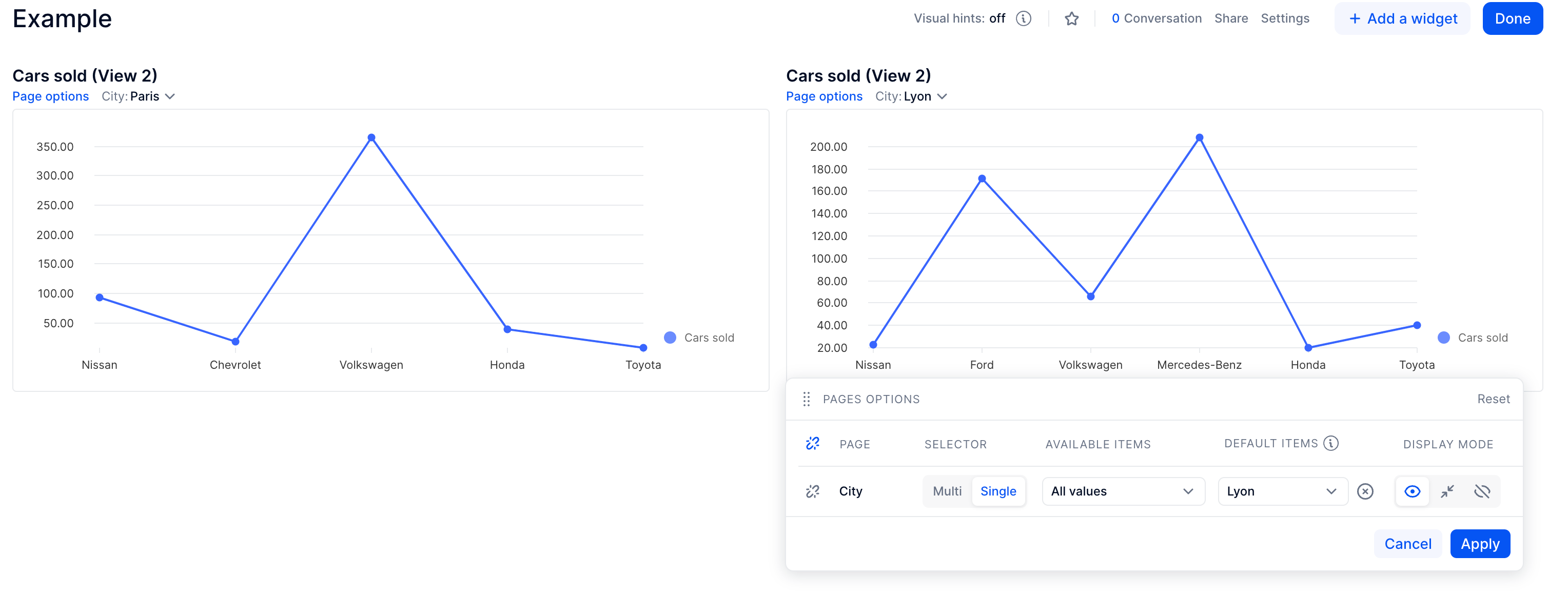
Here’s a small example with a block I have that is by City: I want to show the values for the cities Paris and Lyon in two separate, fixed widgets. Both widgets display the same view, with City as Page in the pivot panel. In each widget’s page option, I have:

  • unlinked the City page selector from the page
  • switched to single selection
  • chosen a default item

That way, the City dimension is not going to change if it changes anywhere else on the page, and you can set it manually.

You could even hide the selector for a cleaner look, if you were to describe it well in the title.

Hope this helps!


Reply