
Implementing design on all your Boards is key to ensure that the powerful models you build in Pigment bring the expected value to all your users, this guide will walk you through design best practices from a Pigment Solution Architect.
Why Design is so Important ?
Well-designed boards have a direct impact on the following engagement factors:
- Adoption: your boards are easy to read, understand and navigate.
- Efficiency: by using your boards, users quickly know how to take actions and / or make decisions.
- Trust: a professional design improves your Apps’ credibility, allowing users to believe in your model’s data & processes.
- Collaboration: design best practices include tips on how to increase board interactivity and boost teamwork.
Key questions to answer before starting your Design implementation
As for any implementation process, you should refer to your personas’ requirements to optimize your boards’ design. The following questions can help you focus on what’s important to share on each one of your boards and how you should do it:
- Who is your audience for this Board?
- What is the purpose of this Board?
- What information do your users need to see on this board?
- What problem are you trying to solve?
- What kind of action / decision are expected to be taken / made when working with this board?
Know your Audience!!!
Audience is key. When working on improving the UX, the audience should always be priority number one. That’s why we recommend building one board per persona when possible, so that you can benefit from all the features available to share only data, visuals and processes that are relevant to your targeted audience.
Key design principles and related Pigment features
Let’s review together some key design principles and see how Pigment features can help you implement them.
Inverted Pyramid
As most people read from left to right and from top to bottom, it is best practice to share the most important insights on the top left of data visualization pages. For your Pigment boards, you can also refer to the Inverted Pyramid Methodology coming from journalism to order your widgets:
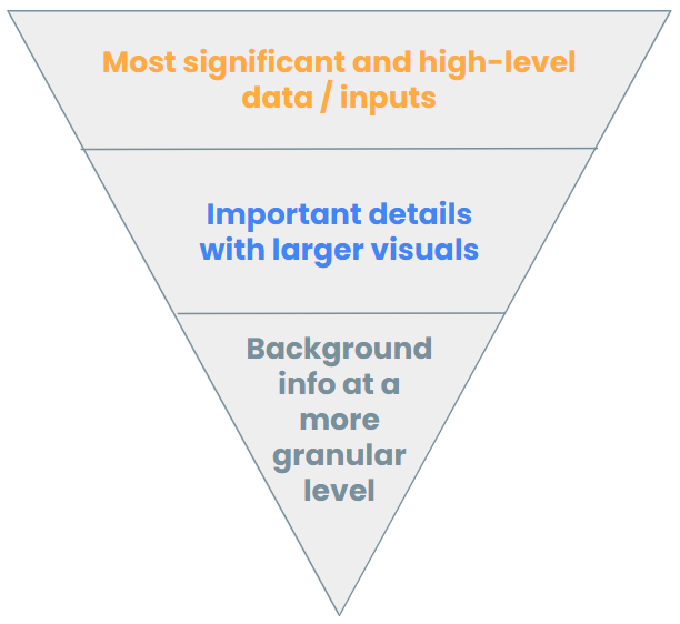
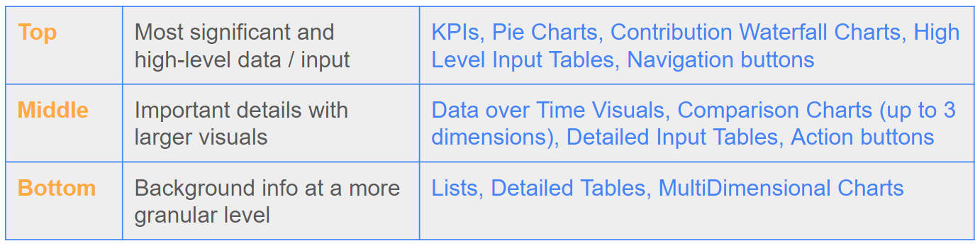
This methodology supposes that every Board is contained in a one-screen page, meaning that in most cases, you won’t be able to satisfy all your users’ requirements in one screen. Try to focus on what’s most needed and train your users on the Drill Down feature to help them find specific info when necessary. You can also split your Board into several ones and use Action widgets to ensure smooth navigation.
Clarity – Consistency – Validity – Interaction
Clarity
Your users should know how to read and navigate your Boards in a few seconds. Make the most of Pigment following features to ensure you provide a simple user experience throughout your Pigment Apps:
The scope is the first element of context that you users should know when working on a Board. Pigment offers you a great number of configuration options to make Board and Metric selection super clear:
- Link to or Unlink from Board: depending on your requirements, apply your filters as Boards’ Page Selector or keep some at specific Widgets level. Use the Page Display Mode Option to hide or minimize irrelevant filters and make it clear to your users how the selection is done.
- Available Items & Adaptive Display: don’t overwhelm your users with irrelevant options. Use those 2 configuration options to narrow down the list of choices users can see on a particular Board or Widget.
- Reorder your filters: on Boards and Blocks, you’re able to choose how you order your selectors to follow your users’ way of working.
Headings & Labels
The choice of the names, titles and labels displayed on your Boards and Widgets is key to improving the clarity of your Workspace. Gather your users’ feedback and customize your views accordingly, using the flexibility Pigment provides on this subject. You can:
- Customize all your Widgets’ Titles.
- Update your Dimensions’ Header Labels on all your visuals.
- Rename your Metrics on every view.
- Add specific Description on each of your KPIs.
- Make the most of the Text and Image widgets to provide the right level of context for each of your groups of visuals.
- Customize your Boards’ details with Colors and Icons to precise their purpose and / or audience.
Formatting
Your users should quickly know how to read and interpret what they see on Boards. Use Pigment formatting features to help them:
- When displaying numbers, a common recommendation is to display max 2 numerals left of the decimal point: use multipliers and prefixes and / or suffixes to ensure your numbers are easy to read.
- Conditional formatting is also a great way to help your users focus on the data which should be considered as a trigger for action or decision.
- Wisely choose your charts’ format: keep in mind that bar and column charts are often easier to analyze, and if you need a Pie Chart then best practices say that it should include max 8 categories. Also, try to eliminate labels on your charts when you can. A clear title or color mapping is much more powerful than unreadable labels: in Pigment you are able to customize your Series Colors on every chart.
- You should always avoid mixing too many dimensions in your visuals, and if you absolutely need to, think of adding a metric selector to your charts.
- As much as possible, you should try to avoid mixing large & small figures in one single visual. Again, you might need to for specific requests, in that case don’t be afraid of using a second axis on your chart.
Consistency
Inconsistent boards can bring frustration to your users, Pigment offers you key features to be as consistent as possible throughout your Apps:
In Pigment you can create as many variables as you need with two benefits: your dimensions’ default values are consistent throughout your App, and you update them in only one place!
Use Pigment native Color Palette to ensure color matching or customize yours to be consistent with your company’s codes and help your users interpret visuals intuitively!
Naming, Icons & Images
We explained above how you can use Icons & Images to bring clarity to your App but try to do it sparingly and build some conventions with your modelers’ team to also use it as a guide for your users. The same kind of conventions should be created for all the names you will display on Boards.
Best practices recommend using sorting to help focusing on what you want to highlight: sort on measures to focus on large and / or small figures, sort on dimensions to compare them. Pigment offers you a powerful way of sorting your data: by any dimension property or by metric value or combination of both – and now you’re unstoppable. Of course, you’ll be able to quickly reorder and delete your sorting criteria.
Validity
You successfully calculated a complex Growth forecast including scenarios, manual inputs with multi-levels workflows, assumptions by version, multiple dimensions, and high-level Pigment formulas… But don’t forget that even though finding the figure itself is key, it’s as important to give your users the right context so that they can understand it and act on it:
- How far are we from the initial plan, target?
- How does it compare with previous periods?
- Which market(s) bring(s) us down / up?
- etc.
Pigment offers you amazing shortcuts to bring this powerful context with simple clicks:
Show Value As & Calculated Items show your values as % of, difference of, sum with, % growth from in correlation with metrics or items of your tables and use Calculated items to easily compare your dimension items!
Conditional Formatting : use conditional formatting including Color Scale to create visual context.
Interaction
All principles mentioned above are key but not sufficient to ensure the adoption of your model and the continuous engagement of your users. Building interactive boards will make you win this challenge, as we humans need to play around to trust and adapt. Here’s a list of features which can help you to bring interaction and collaboration into your Apps:
Filtering Selection: make the most of your Page Selectors by training your users on the powerful “Set as Page” functionality: they can now autonomously compare, check and deep dive into data from one screen and with great simplicity!
Automations: implementing automation is a great way to set a collaborative experience for your users when working on Boards. Triggers, recipients, and messages are all customizable to let you bring the most value to your processes!
Some native features don’t need any implementation but maximize interaction on boards. You can highlight them in Text Widgets to make sure your users know and use them:
CommentsPersonal ViewsHistory
Show us your best practices!
Do you follow any other Board Design Best Practices? Let the community know by sharing them in the comments section!
Read to see a real world example of these design practices in use? Check out UX Design in the real world, an example walkthrough of a Board design from a Pigment Solution Architect.