Implementing design on all your Boards is key to ensure that the powerful models you build in Pigment bring the expected value to all your users. In the Get Started in Pigment :UX Design article we discussed the theory of UX design. This article is going to walk through a real life example and provide tips on how to configure your Boards.
This article walks through a real world example with tips on setting up an User Experience(UX) , we highly recommend reading Get Started in Pigment :UX Design to understand the theory behind why these design choices were made.
Requirements
Here are the requirements for our sample Board.
Your CFO needs a board to define the Current Year monthly Reforecast for the whole organization:
- Understand how Actuals impact Next Period Forecast:
- Actuals vs Forecast % on Actual Period
- Related updated Forecast for Next Period
- Input Country level targets to update the forecast for Next Period:
- Default reforecast is calculated by splitting the amount based on Next Period initial trends, with the initial Country split
- Manually change Target Amounts
- Visualize impacts of inputs on Country, Product & Month Full Year Amounts.
Build
Let’s apply the Inverted Pyramid principle to our use case, keeping in mind that we also want to match the process order:
- Top => high level results of the Actual Period performance
- Middle => input widgets with related important details
- Bottom => detailed results at a more granular level
Create 3 Text Widgets and 3 Image Widgets to build those sections. Use the formatting and color options to highlight them (don’t forget to properly use the color palette as we will need color consistency across all our board’s widgets.)
Section 1 - Actual Period results
In this section we will use the an Actual Results Table to show the most important high level figures for our Actuals period.

KPI Steps
- Create a new view called for your KPI View.
- Use the Pivot panel to display a Net Sales Metric by Version.
- Update the Pages Selectors Options to:
- Preselect the Current Year through an Item Variable
- Preselect the Actual Period
- Keep only Actual and Forecast Versions as available items
- Use the Sort Options to display Actuals first
- Create a Calculated Item to display the Actuals vs Forecast result in %
- Use the Formatting Options to optimize the readability of numbers, using multipliers + prefix and suffix
- Create a Color Scale to highlight positive and negative results
- Duplicate the KPI View view to create a new view called for your KPI View (FY)
- Update Page Options to keep all available Period Types
- Update the Calculated Item to display the updated Forecast for Forecast Period
- On the Version dimension, create a new Unique Text Property called “Display Name 01” to rename your “Forecast” version with “EoY Forecast” on this view (use the “Update Header Label” option on the Version Column).
- Add these 2 KPIs to your board and:
- Update Page Option to unlink Period Type and Version from Board, define relevant values and hide selectors.
- Hide the Widget titles
Add Context
These figures needed some context, I wanted to make sure that you could see the months it applied it.

Context Steps
- In an Actual Results folder, create a new Metric for Current year forecast #1
- The Metric formula should render a text specifying the starting Month for your Fiscal Year and the last month of the Actual period. You can create a new Text property on the “Month of Year'' dimension if you want to display abbreviated month names.
- In the KPI view, use the Format Options to add “Actual Period” as description.
- In the Actual Results folder, create a new metric for your Current year forecast #2
- The Metric formula should render a text specifying the starting Month of the Forecast Period and the last month of your Fiscal Years.
- In the KPI view, use the Format Options to add the “Forecast Period” as description.
- Add these 2 KPIs to your board and update your Widget Titles and size:
Create Visuals
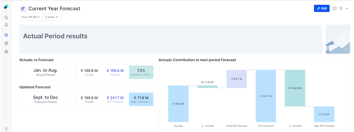
The KPIs and also supporting context are lacking a visual way to represent our data, to combat that, I added some visuals.
Visual Steps
- On a Table for Actual Results, duplicate the “KPI View (FY)” view to create a new view for a waterfall:
- Update Page Options to keep only Actuals & Forecast as available items
- Add the Period Type Month Property as Rows
- In the Chart Section, create a Variation Waterfall chart and update the Style to match with your Color Palette.
- Use the “Update Header Label” option for Period Type Dimension and your Calculated Item name to clarify your Waterfall X axis.
- Add this chart to your board:
- Update Page Options
- Update the Widget title to bring more context
Provide Interaction
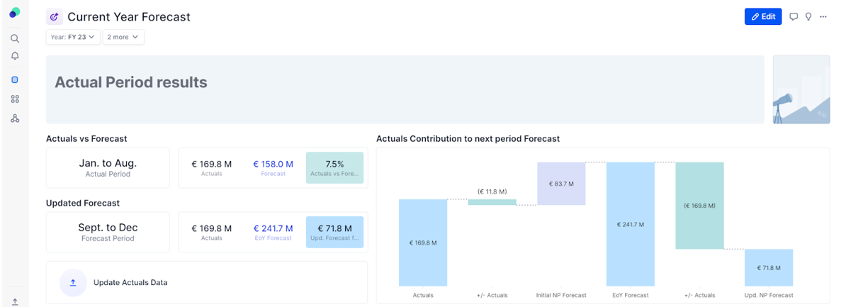
I wanted to make sure that we had the ability to interact with the data, in this case I provided an action widget to ensure they could upload Actuals to fix any data misalignment.
- Create a “Trigger an import” Action card to let your users easily fix data misalignment.
Section 2 - Reforecast Inputs
Add Input Grid
In order to reforecast, we are going to need an input grid. Because this is the most important widget for this section, I started here.

Grid Steps
- Create a new table for your reforecast inputs
- Use the Pivot panel to display the Input Reforecast Metric by Country & Product.
- Update the Formatting Options to highlight cells where Input is allowed vs Subtotal cells, and only then move Country from Rows to Pages
- Add this grid to your board:
Add a Summary grid
After adding inputs, you want to create a Table that can showcase the new summary.

Summary grid steps
- Create a new table for the reforecast summary with the 3 Metrics for the following:
- Net Sales (Forecast)
- Net Sales (Default Reforecast w Months)
- Net Sales after Reforecast
- Use the Pivot panel to display all Metrics in Columns with a split by Period Type in Columns as well, and Country details in Rows.
- Choose now a color coding to distinguish Actuals, Initial Forecast and Reforecast, that you will use in all other visuals.
- Create visual hints for users:
- Use the “Net Sales after Reforecast and select the Add this Metric again option, to display the difference between Input Reforecast and Calculated Reforecast (“Show Value as” option). Rename all Metrics to bring more clarity.
- Use conditional formatting to help users immediately see the results of their inputs (= how far are they from initial targets).
- Create tracking metrics for users. In the a Reforecast Metrics folder:
- Create a new Dimension (Status) and an Input Status Metric, to let users update each Country Reforecast status. Use a formula to add a default value for this new table column.
- Create a new Text Input Comment Metric and use a combination of formula and conditional formatting to encourage your users to leave comments for their teams.
- Add this Table to your board:
- Minimize Country and Product Selector as Page to keep a clean board
- As those 2 selectors are set as Board Selectors, you can use the Country Rows from the Summary Grid to filter on the Input Grid with the “Set as Page” functionality. Same trick to see Product Details for each Country on the Summary Grid, by using the Product Rows as Page. Show them above Widgets for more clarity:

Section 3 Reforecast Outputs
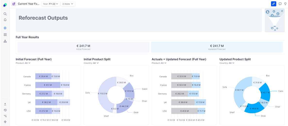
In this section we will use a Table for Reforecast Results to show the output of our reforecasting.

- Create a new view called “KPI” and display the Net Sales (Forecast) and the Net Sales after Reforecast Metrics in Columns, with Year as Page. Use the Formatting Option to apply the Color Coding you chose in the previous section. Update the KPI view’s options to bring context and add this View to your Board:
- Initial Forecast:
- Create a new view called “Country Contribution (Initial)” and display the Net Sales (Forecast) Metric in Rows with a split by Period Type and the Country details in Columns. Format the Chart view as a Stacked Horizontal Bar Chart. Update the Series Colors to apply your Color Coding and hide the Legend.
- Duplicate this view to create a new view called “Product Split”, displaying the same Metric with Product in Rows and Year + Country as Pages. Format the Chart view as a Pie Chart. Play with radius and corners, update your Series Color and hide legend.
- Add those 2 charts to your board:
- Duplicate these 2 views to display the Reforecast results on the board.
- Unlink from Board Product Selectors from the Bar Charts and Country Selectors from the Pie Charts, to let users analyze results through key angles.
Review any Additional Details
Before moving on, you always want to review to ensure you have handled any additional requirements or details.
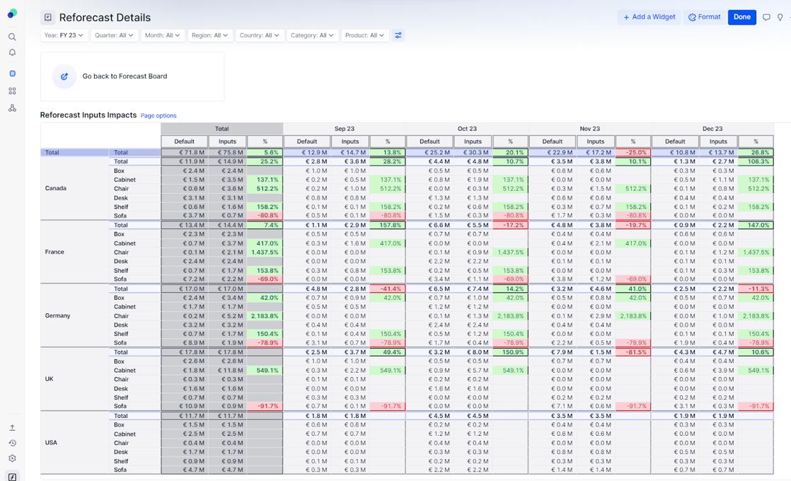
As specified in the Requirements, you should allow your users to analyze the results with Country and Product details.
Steps to add Country and Product details.
- Create a new view called “Detailed Grid”, to display:
- “Net Sales (Default Reforecast w Months)”
- “Net Sales after Reforecast”
- Growth (“Add this Metric Again” > “Show Value as”)
- by: Country (Rows), Product (Row), Month (Columns) an on: Current Year and Forecast Period (Pages)
- Use a Color Scale to provide visual hints in this Table
- Create a new Board called “Reforecast Details” to display this table and add a “Card” Action Button to your “Current Year Forecast” Board to link to this “details” Board:
- Add all the necessary selectors and use the “Dependent Page Selection” option to ensure a smooth filtering.
- Add a Navigation Action Button to this new board as well, to ensure a smooth UX:
Thank you for reviewing this steps, if you have any question on how this was done, please comment below!
If you haven’t already we highly recommend reading Get Started in Pigment :UX Design to understand the theory behind why these design choices were made.


