Hello Pigment!
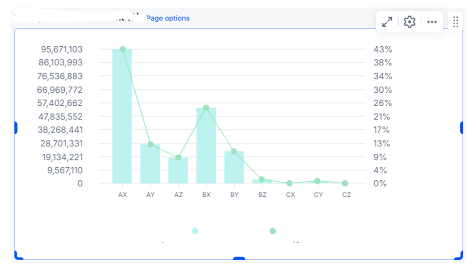
I am currently working with some charts for a board, but I encountered a issue: the axis labels are showing very random values, based on the values I have available:

“95,671,103”? why not 95,000,000/96,000,000?
“86,103,993”? why not 85,000,000/86,000,000?
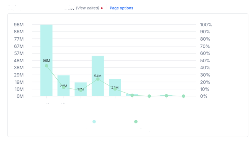
My first solution was to set the left axis labels to millions, so the information would be clearer:

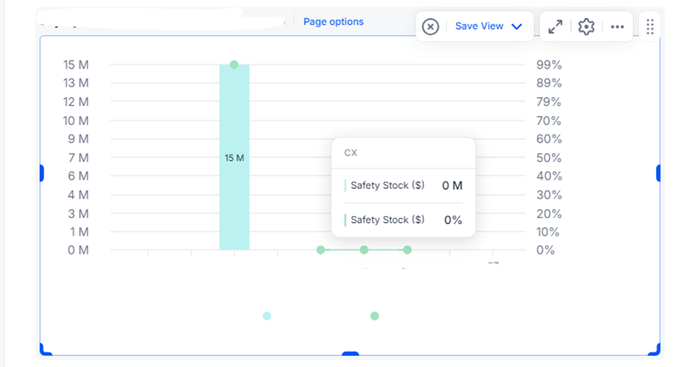
The problem occurs when I apply filters or use the selectors on my board and my values drop below millions; it shows decimals or even just 0:

Is there a way to make it dynamic and recommend more appropriate values?
Thanks in advance


