Use the Layout tab in Pigment to choose between two grid display modes (Tabular and Tree) and set the Totals position in the grid. When you choose the type of grid you want, you can customize it to make it more user friendly.
Table of Contents
Overview of Display Modes
In Tabular mode, Dimensions in rows are displayed in separated columns.
-
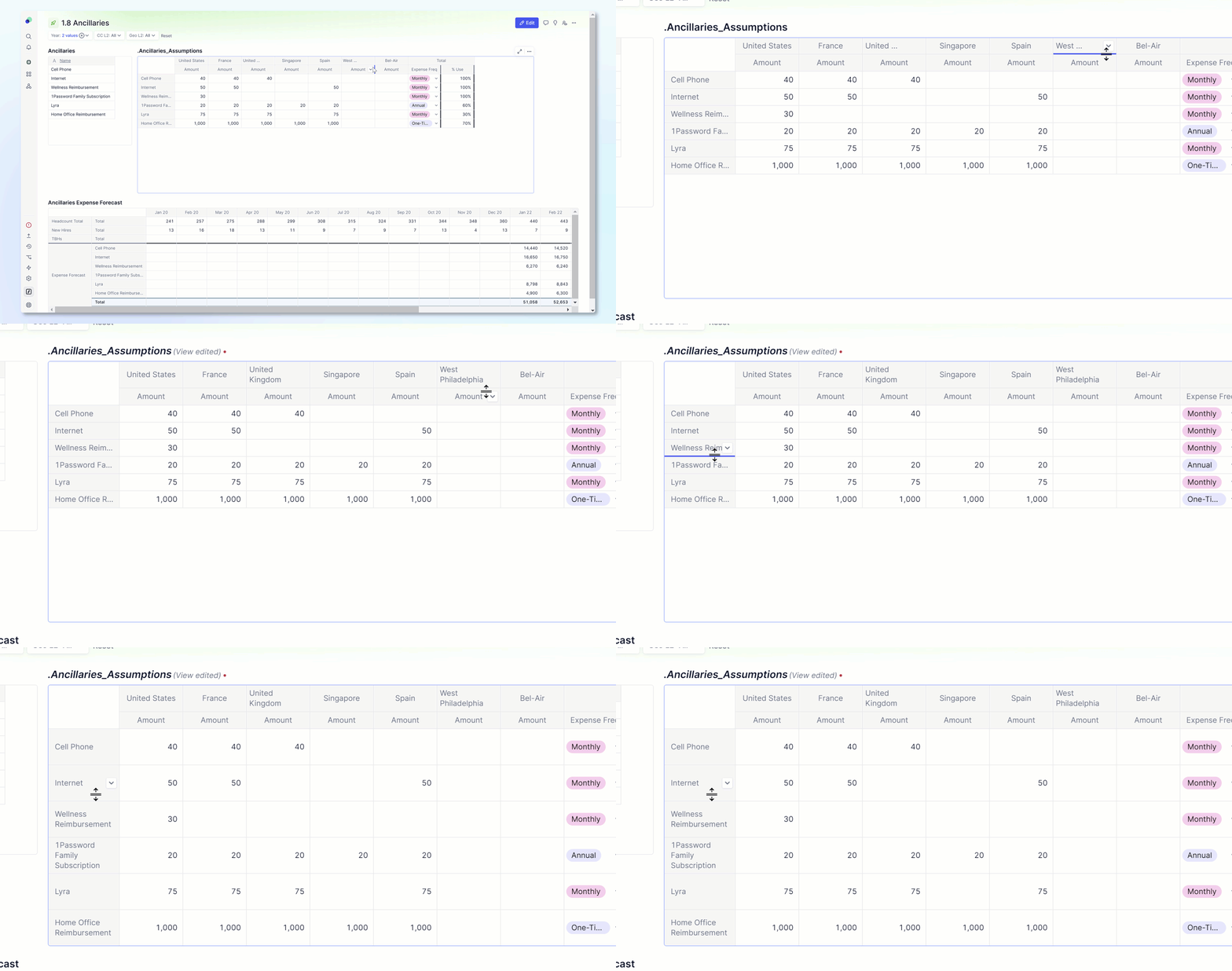
Row height. The Row Height option controls the size of rows within a grid. These are the sizes of the row height options; Extra Small 20 pixels, Small 28 pixels, Medium 44 pixels, Large is 58 pixels, and Extra large is 108 pixels. To adjust this setting, drag and drop the row divider.
If a Metric is using a data type of Text and the row height is Large or Extra Large, the text in the cell is wrapped into multiple lines.
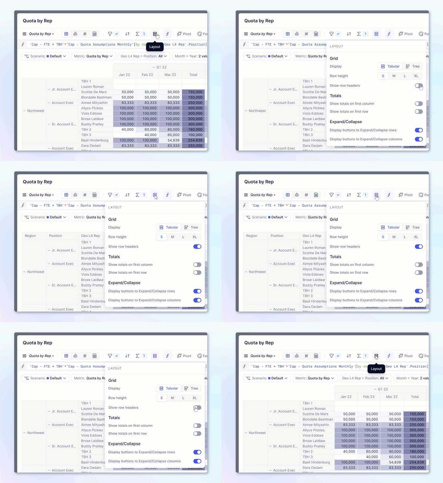
- Show row headers. When in Tabular mode, you can toggle on and off the row headers. These headers will display the name of the blocks that are pivoted into Rows. When Metrics are in rows, it will say Metrics and not the name of the Metric.
-
Header height and text wrap. To adjust Header height, drag and drop the header divider to the desired height. When the header is large enough for two lines of text to fit, text wrapping is automatically applied.
-
Gridlines. Hide or display the horizontal and vertical gridlines depending on your data visualization requirements.

In Tree mode, Dimensions in rows are displayed within the same column, one above/below the other.
Notes on the Tree mode:
- Use the plus (+) and minus (-) icons to expand and collapse directly on the row headers.
- Toggle off the option "Show Totals on first row" from the same panel, which is toggled on by default.
- Applying formatting on a row applies to that row only and not the underlying rows.
Show row header
When in Tabular mode, you can toggle on and off the row headers. These headers will display the name of the blocks that are pivoted into Rows. When Metrics are displayed in rows, the row header displays the word Metrics and not the name of the Metric.

Densify headers
The "Densify headers" option is particularly useful in order to save space when a Table's View contains Metrics that share different sets of Dimensions. Here is what it does:
- With the option switched off, the Table's View displays the Dimensions one after the other, showing a Total header in case the Dimension selected in the Configure panel is not defined on the Metric.
- With the option switched on, the Table's View tries to make the row headers as compact as possible, fitting them on the same column. For example, if your Table contains four Dimensions but each Metric needs only two, the Table layout only displays two row headers instead of four.
Caveat
With the option switched on, there are a few cases when swapping two Dimensions in the Configure panel is ineffective. This happens when there is no better way to accommodate the layout given the other Dimensions in the Table's View. If you do need those Dimensions swapped, switch the option off.
Displaying Expand/Collapse Icons
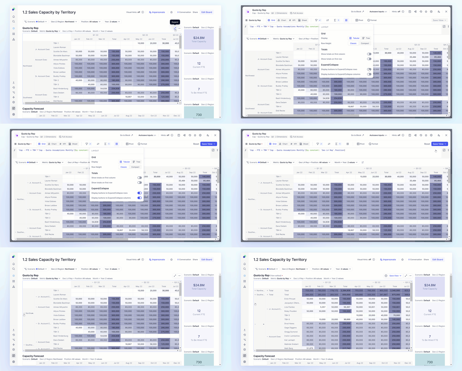
There are two toggle options under the Expand/Collapse sections that can be used to add a plus (+) or a minus (-) symbol next to grouping for Members to easily expand or collapse rows and columns in Boards. Members can toggle on the icons in rows and or columns. The option is available in both Tabular and Tree view. In Tree view, the Expand/Collapse on rows is always displayed.

Show Hierarchies in Tree View
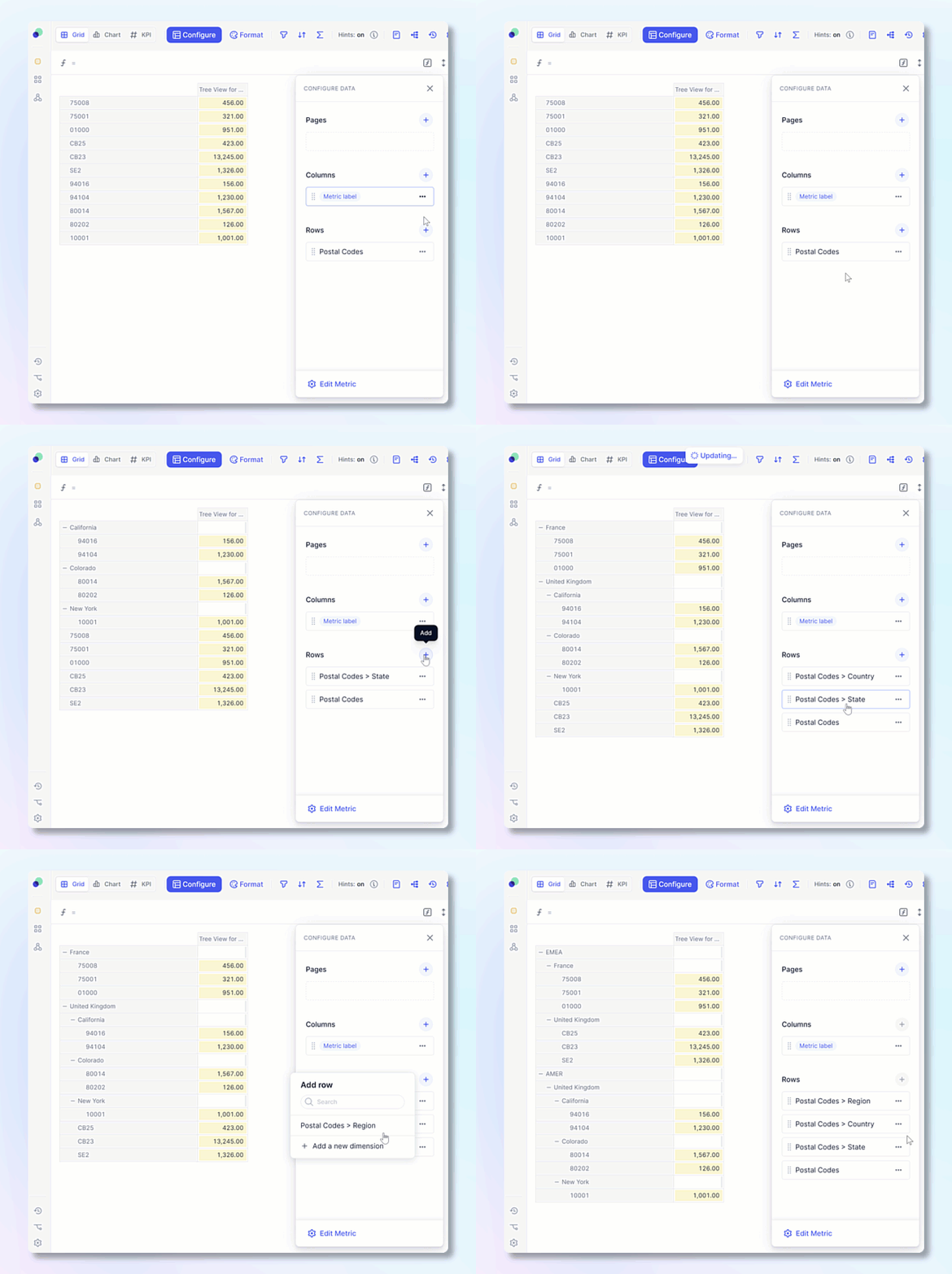
You can show hierarchies in tree view to easily show how data is aggregated. Once showcased, you can use the Expand and Collapse functionality with the plus (+) and minus (-) icons. Hierarchies in Pigment are established by grouping items using List properties. Items that are not grouped with any other items are displayed at the bottom.

Show totals on first row
In Tree view, you can control if totals appear at the top or bottom by toggling on Show totals on first row.
