
Bar charts are useful for showing comparisons between categories of data or comparing changes for multiple groups over the same period of time. This article provides a comprehensive overview of the customization options available for Bar charts.
The way you set up your View has a big impact on your final Bar chart. The following articles will help you effectively set up your View before customizing your chart:
- Use the Pivot feature to change the axis and add/remove Dimensions.
- Use the Filter feature to remove Items from a list.
- Use the Sort feature to change the order of Items in the chart.
Here are the options for customizing a Bar chart:
Setting | Description | Options |
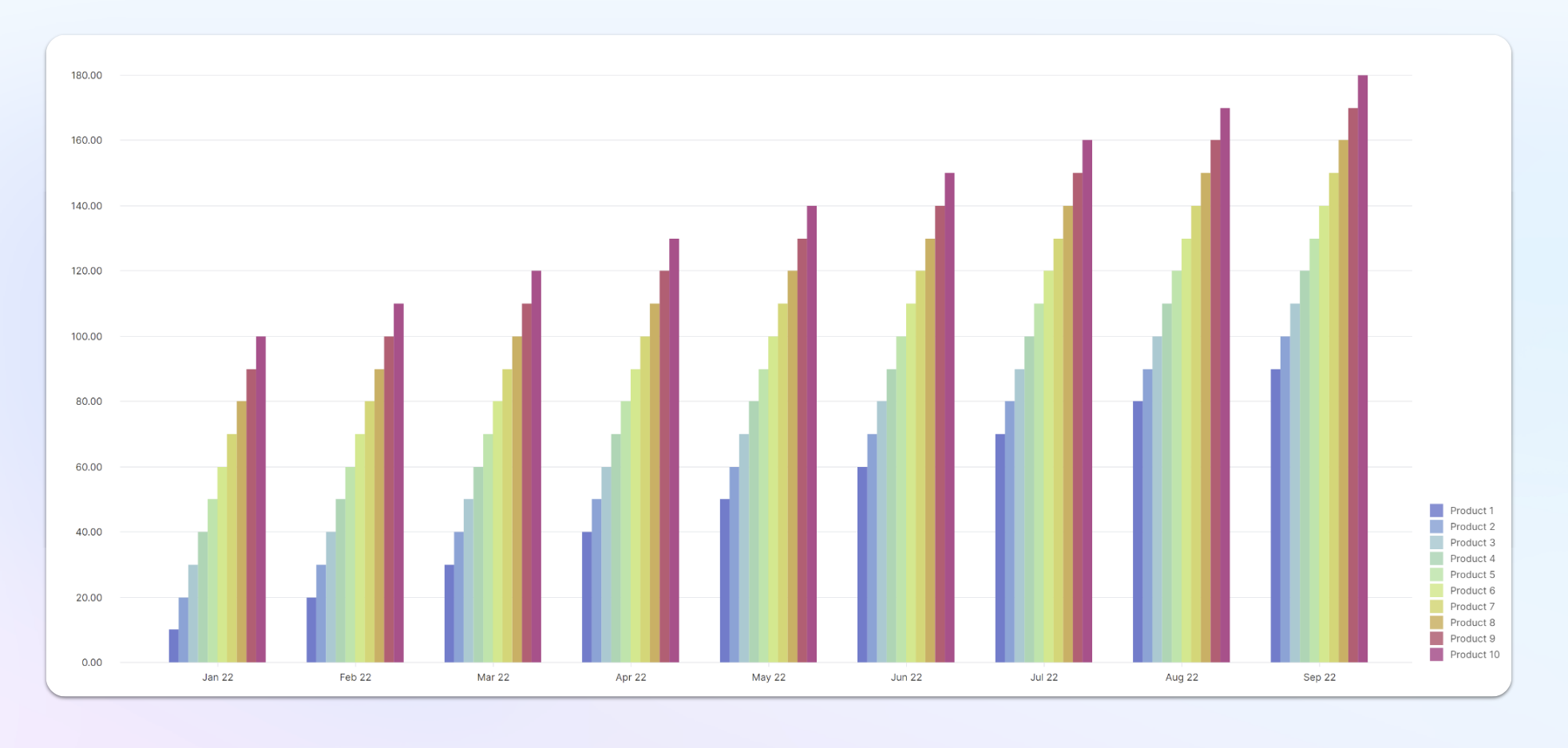
| Layout | The Layout setting configures how series are clustered visually on a chart. | Grouped: Series are clustered side-by-side.
Stacked: Series values are added on the Y-axis, so each consecutive series appears above the last one. Make sure the units of all series match. |
| Bar direction | The Bar direction setting configures the bar direction.
| Vertical: bars of each series will be displayed vertically.
Horizontal: bars of each series will be displayed horizontally. |
| Bar margin | The Bar margin setting controls the width of each individual bar. | Move the slider to the right to increase the thickness of the bars or left to reduce it. |
| Show bar label | The Show bar label setting shows/hides the label inside each bar displaying the value of the bar. | Toggle on/off (on by default) When bars become too thin to display within the bar they will disappear unless Allow Label overlap is turned on. |
| Bar label position | The Bar label position setting allows you to position the bar chart label at the top of the bar instead of the center in Grouped chart layouts. | Toggle on/off (on by default) |
| Allow Label overlap | The Allow Label overlap setting shows/hides the label inside each bar displaying the value of the bar. This feature ensures labels are present even if the bars are too thin. | Toggle on/off (on by default) |
| Show stack total | The Show stack total setting displays the total of a bar stack at the top of the bar in Stacked chart layouts. | Toggle on/off (off by default) |
| X label orientation | The X label orientation setting configures the orientation of the X-axis labels. Longer labels automatically have wrapped text. To avoid label overlap, use the diagonal or vertical option. | Horizontal, vertical or diagonal. Diagonal labels are not supported when multiple dimensions are displayed in the axis at the same time. |
| Color theme | The Color theme setting configures different presets of colors to represent each series. | Outside of your Workspace color Palette. Pigment support 9 presets; Pigment, Rainbow Spectrum, Copenhagen Facades, Sunset Boulevard, Winter Wonderland, Utility, Moreno Glacier, Autumn in New York, Summer sky. |
| Series colors | The Series colors setting allows you to select the individual colors for Items within a Series. | Assign each Item its own individual color. Pigment remembers the order of your selection if you switch through different Color themes. For example, if you assign an Item the first color in a palette, it will remain the first color regardless of which theme you select. |
| Show X gridline and Show Y gridline | The Show X gridline and Show Y gridline settings enable the appearance of gridlines extending from the X and Y-axis. | Toggle on/off (on by default) |
| Hide Y axis | The Hide Y axis setting removes the Y axis from view. | Toggle on/off (on by default) |
| Show legend | The Show legend setting shows/hides the Legend of the chart series. Use this option to display or hide the legend. | Toggle on/off (on by default) |
| Legend position | The Legend position setting configures the position of the legend. | The legend can be set to 4 different positions: Bottom right (default), Top right, Bottom center, Top center. |