
Waterfall charts help visualize the change between two values or situations. They are particularly useful for understanding how an initial value, such as a Budget, is impacted by a series of positive and negative changes to reach a final value, like Actuals. In Pigment, you can create different types of Waterfall charts, also known as Bridge charts, to analyze these variations. This guide covers how to build Combination and Variation Waterfall charts.

Customize your Waterfall chart
Here are the common customization options for Combination and Variation Waterfall charts.
| Setting | Description | Options |
| Balance data | The Balance data option adds an additional bar to represent any variation or contribution not fully explained by the displayed data. This ensures the total difference between start and finish values is accurately reflected. | Toggle on/off (off by default) |
| Padding | The padding allows you to play with the spacing between bars |
From 0 to 0.9 |
| Auto scaling | By default, Y-axis starts at 0. If activated, the scale will be inferred from the underlying data. | Toggle on/off (on by default) |
| Connecting lines | The connecting lines option allows you to add dashed lines between the bars. | Toggle on/off (on by default) |
| Hide zeros | The hide zeros toggle allows you to hide the bars with a value of 0. | Toggle on/off (on by default) |
| X Label orientation | The X label orientation setting configures the orientation of the X-axis labels. Longer labels automatically have wrapped text. To avoid label overlap, use the diagonal or vertical option. | Horizontal, vertical or diagonal |
| Allow horizontal scroll | The Allow horizontal scroll setting allows you to toggle on and off horizontal scrolling along the x-axis. | Toggle on/off (on by default) |
| Step color | Choose the color of your step. | Color picker (grey by default) |
| Ascending values color | Choose the color of your ascending values. | Color picker (green by default) |
| Descending values color | Choose the color of your descending values. | Color picker (red by default) |
Use Contribution or Variation mode
There are two types of Waterfall chart:
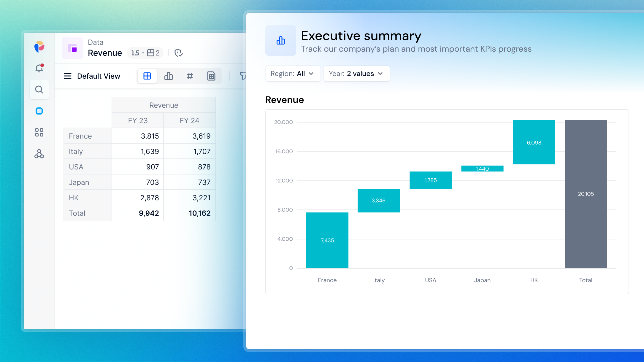
- Contribution Waterfall. This type of Waterfall chart is used to explain the contribution of each element to the sum (generally Metrics with a unique column, otherwise Pigment sums the data columns to have get a unique column).
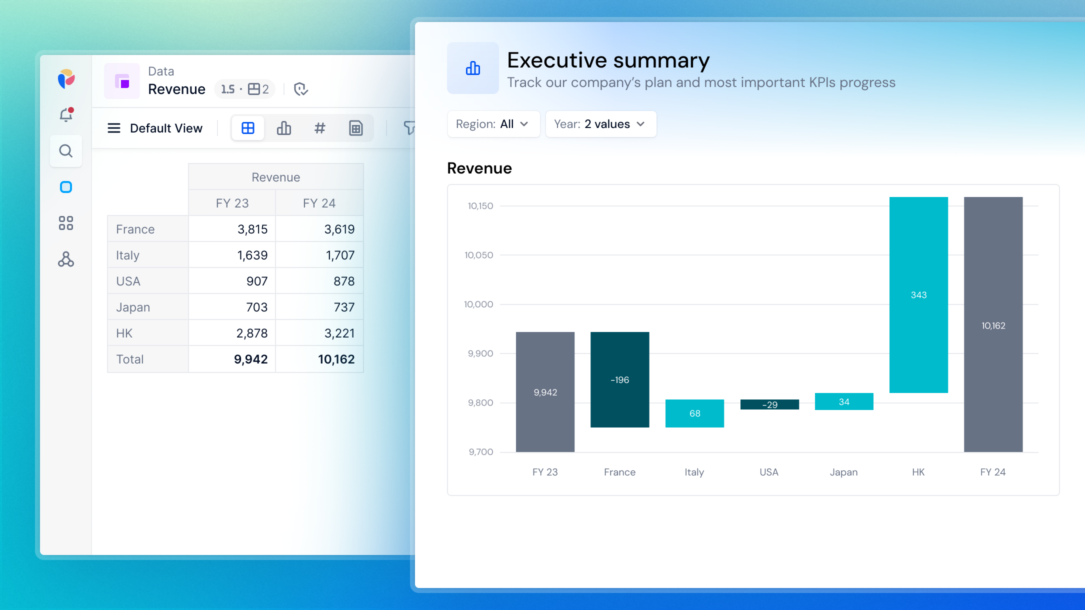
- Variation Waterfall. This Waterfall chart calculates the difference between two columns to determine variation bar values.
For example, if a Metric has 2 columns (FY 23 and FY 24), you can visualize your data in two different ways:
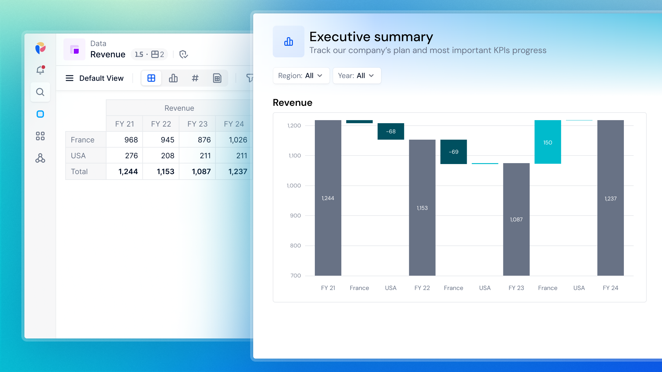
- Variation mode which explains the differences between FY 23 and FY 24 due to the variation between each country. Adding a new column adds a new step.
- Contribution mode which sums FY23 and FY24 to highlight the contribution of each country in the total.
Create a Waterfall chart
You can create a Waterfall chart from a Table containing multiple Metrics.
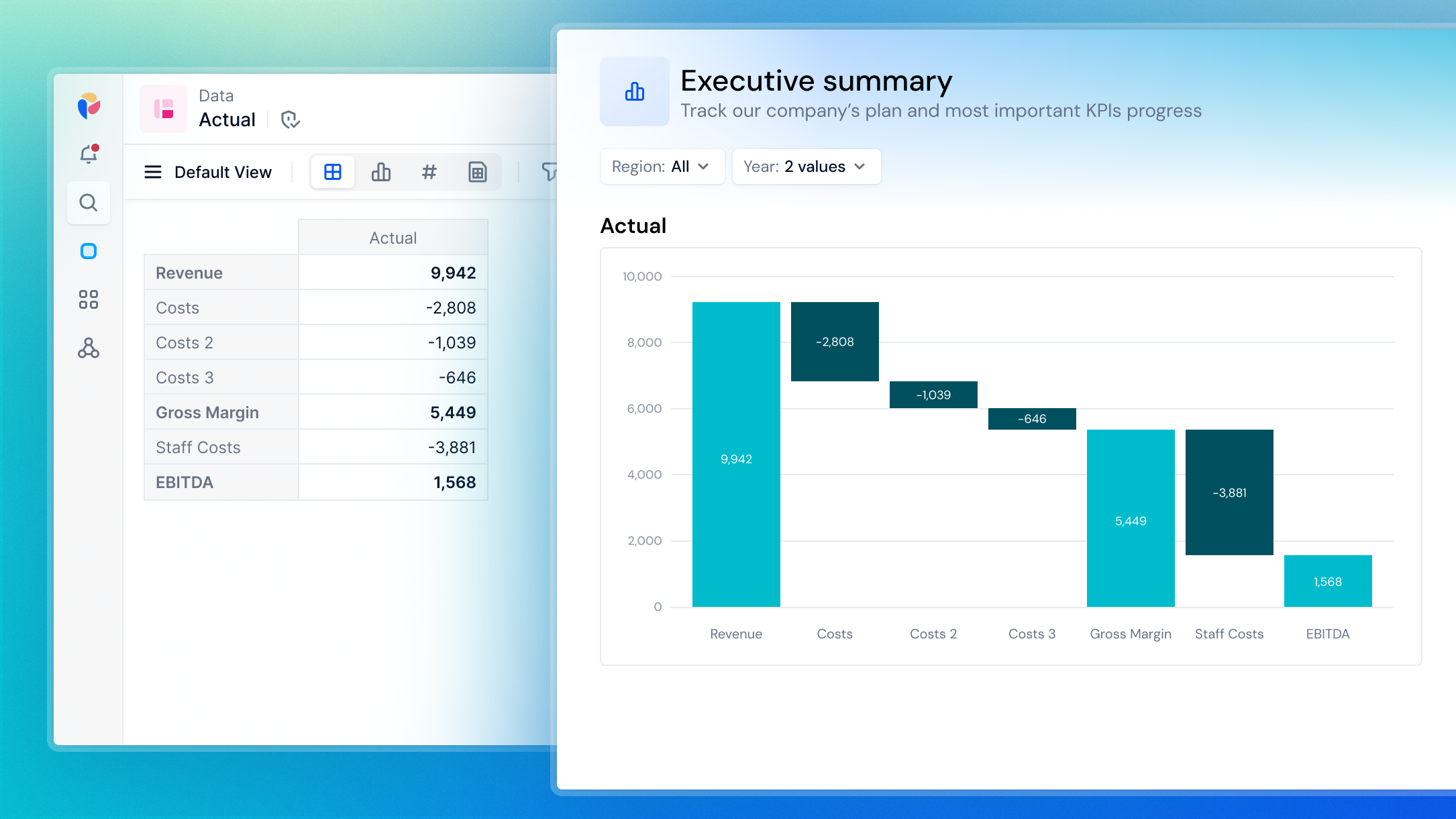
Put your Metrics in rows so the Waterfall chart automatically selects the first Metric as the Initial step and the last Metric as the Final step. If your Table includes intermediate sums, use the Middle step(s) to add these Metrics as steps in your chart.
 Important
Add your metric to Columns in the Pivot panel for optimal results. Placing metrics in Rows may cause unexpected displays in your Waterfall chart.
Add multiple Steps
In Variation mode:
- Add a new column to create a new step.
In Contribution mode:
- In your Table, add the step to rows. See
Gross Marginin the example below. - Go to the Format panel.
- Add a Middle step by choosing the Metric from the drop-down menu.
Group Items in Variation mode
In Variation mode, you can group variations to highlight only the Dimension Items that had the greatest impact on a Metric's change over time.
When you toggle Show variations number controls to On, variations are ordered by descending absolute value. By default, the chart displays the top three variations, but you can customize the default variations number to suit your organization’s reporting needs. The remaining variations are grouped into a single bar. This improves readability and emphasizes the key contributors to change in your charts.
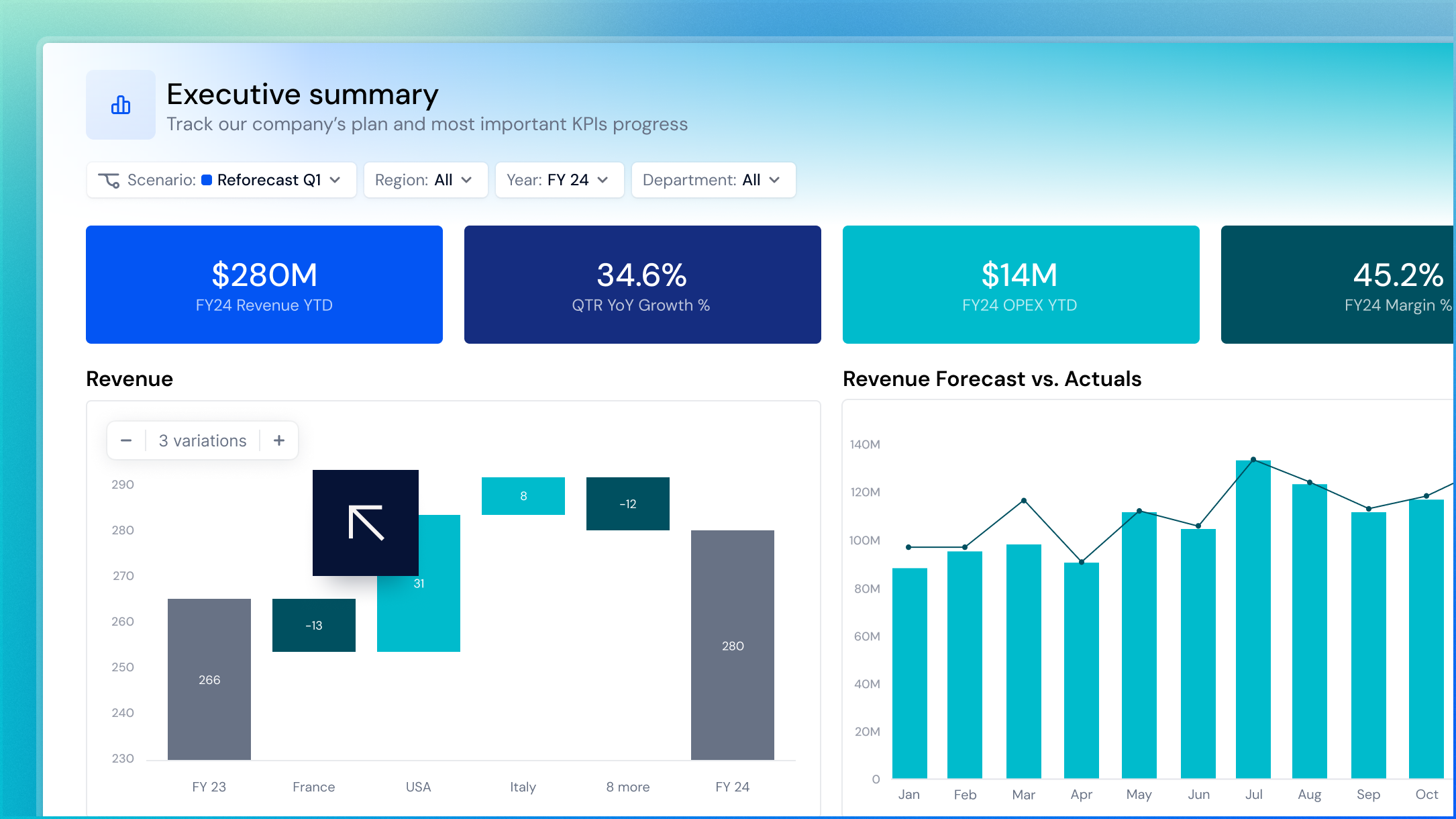
This option also enables the Variation control on the chart. Members can adjust the values from the Board or View using the Variation control. Changes are not saved, and each time you reopen the Board, the chart defaults to its predefined Variations number setting.
To group variations and show the Variation control on a chart:
- Go to your Application.
- Open a Table or Metric.
- Select Chart, then Format.
- Select Waterfall chart, then enable Variation mode.
- Toggle Show variations number controls to On to display the Variation control for Members. The control appears in the top-left corner of the chart on hover and defaults to showing three variations. Use the Variations number slider to set the number of default variations for the chart.
- Select Save View.