
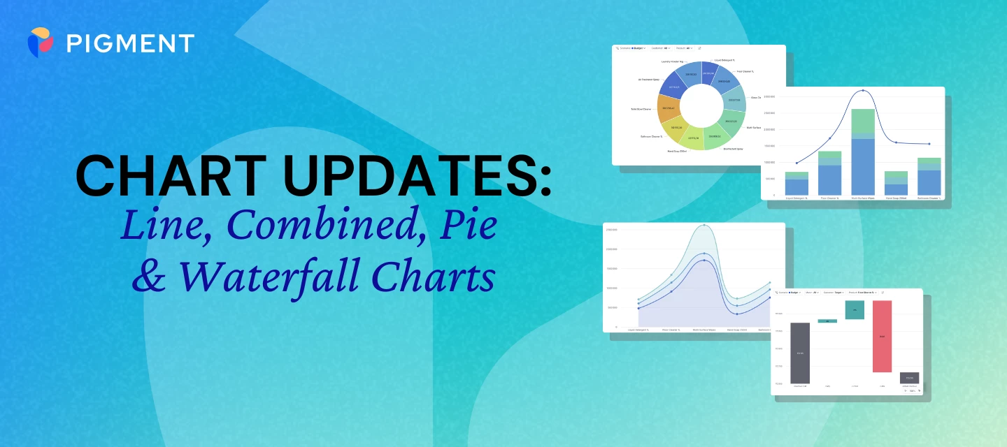


We’re continuing to roll out improvements to charts in Pigment, this time focusing on Line, Combined, Pie, and Waterfall charts.
These updates are designed to make charts clearer, more readable, and easier to explore, especially when working with more complex datasets.
What’s New?
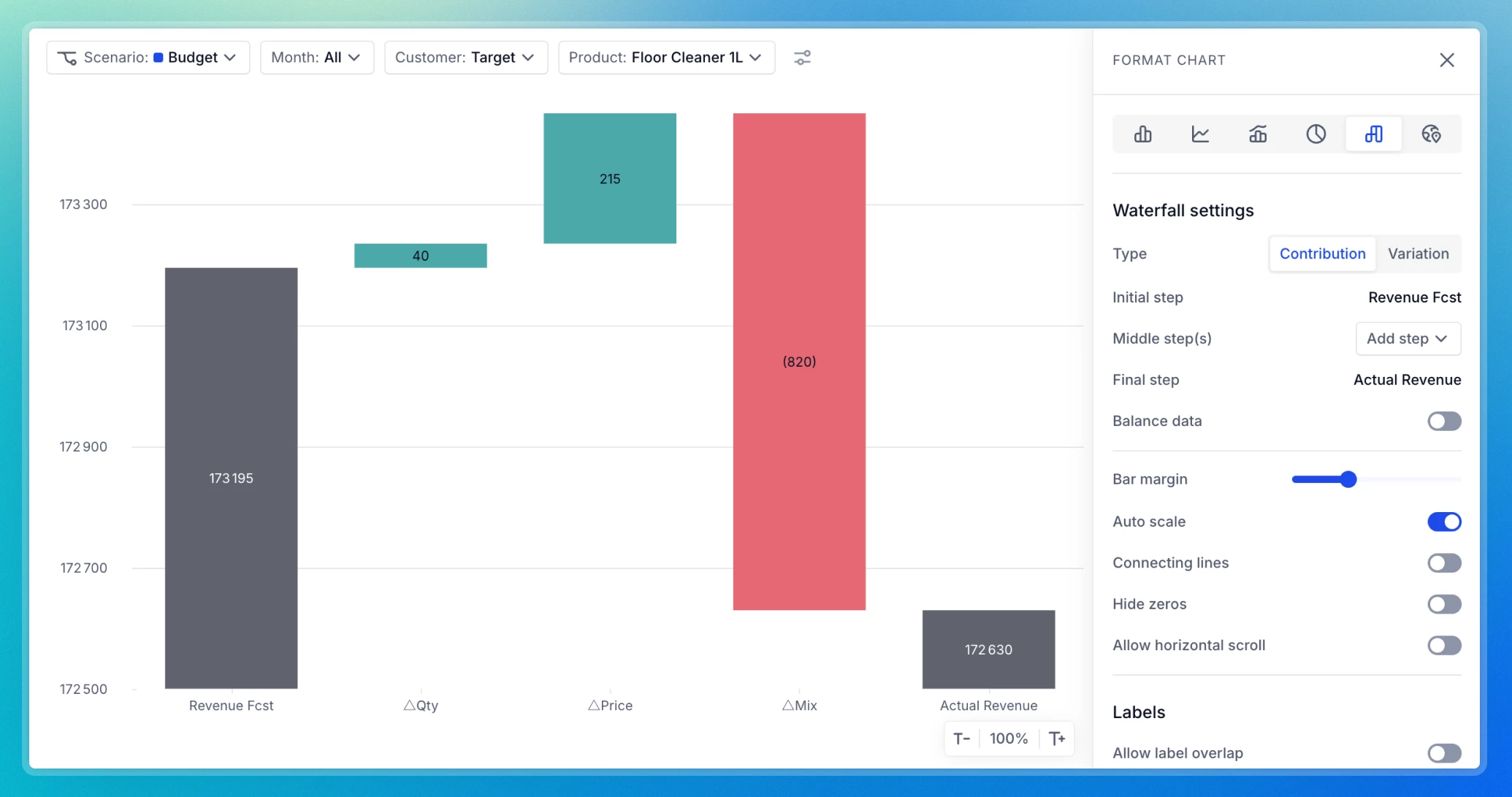
We’ve made a series of updates to improve your experience with Line, Combined, Pie, and Waterfall charts:
- Improved Readability: Cleaner spacing improves label and legend visibility, while clearer area rendering in stacked Line charts prevents overlap. Pie chart labels are also easier to read, making it simpler to interpret insights at a glance.
- Clearer Chart Visuals:
- Intuitive Tooltips: Hover anywhere along the chart to see all values at a given point in time, with no need to target individual data points.
- Scrollable Legends: No more lost information! Legends containing long lists are now scrollable, ensuring every item remains accessible.
- Left-Aligned Color Markers: To make identifying series easier, color markers now appear to the left of each label rather than above them.
- Optimized X-axis label rendering: Diagonal and vertical X-axis labels now display more clearly, improving readability, making labels easier to scan, and allowing more labels to appear at once.
- Grid lines placed between bars for better readability: Grid lines now appear between bars, making them easier to read.
For a full visual walkthrough of these updates, you can download our detailed PDF guides below to see side-by-side comparisons.