


There are limited graphing capabilities in Pigment today vs. what’s available in Powerpoint, for example.
- You can not do multi-axis graphing feature today in Pigment. An example of stacked bar of loan balances and then adding the yield trends in %s on top.
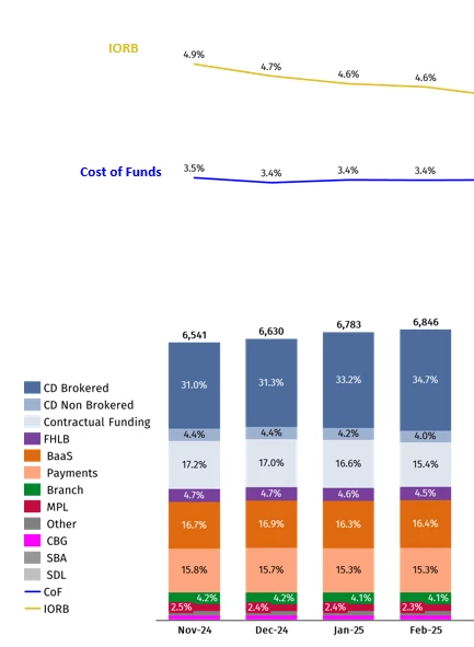
- Even on a single axis graph, you can not do a trend line graph on top of a stacked bar
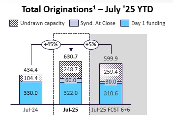
- There are some valuable features from Think-cell plug-in to Powerpoint that would be helpful in Pigment (https://www.think-cell.com/en). Below is an example of showing % increase between the stacked bar (a think-cell feature)
Also, given that you guys are Pigment, we would have expected more color palette options for graphing but it’s very limited at the moment when we have various data points :)