
Hello community,


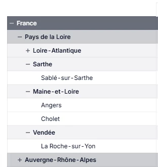
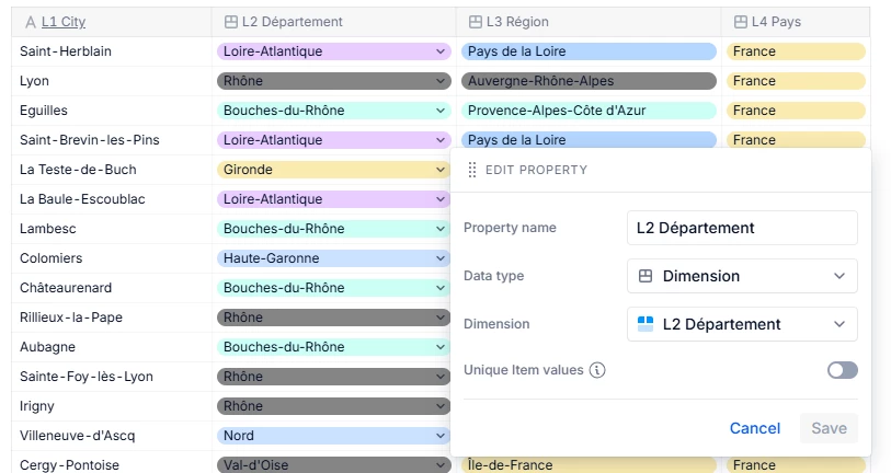
I have a dimension City, with Department/Region/Country parents.


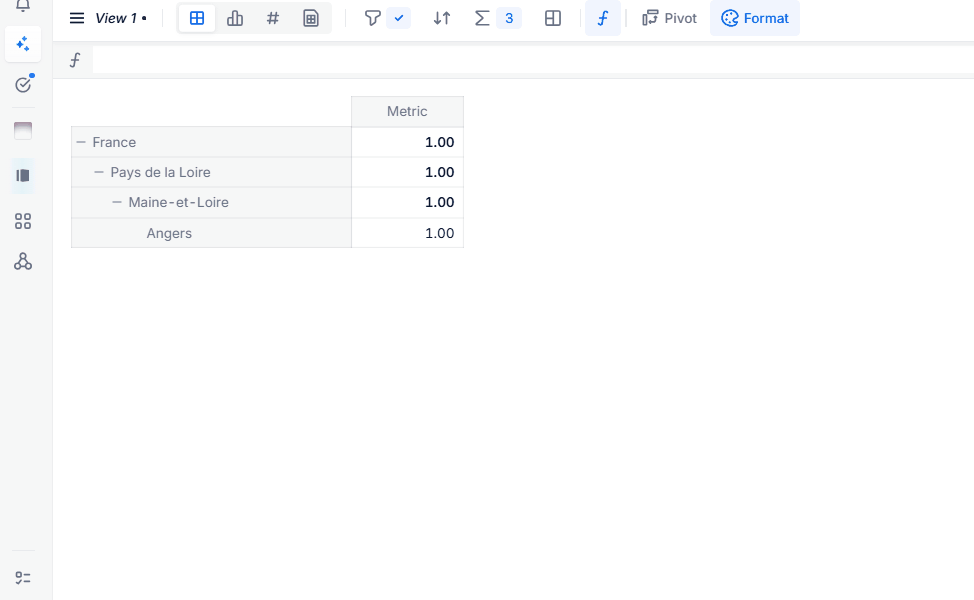
I would like to use a Conditional Formatting on a metric, probably based on another source metric, to display raw data dynamically on a specific color according to the level of granularity.


But I don’t know how to create a metric which calculate the level of granularity of my dimensions. 


Let’s see my exemple: 

Dimension 1 : City 

Dimension 2 : Department > City

Dimension 3 : Region > Department

Dimension 4 : Country > Region

Metric : Budget per city


Do you have any clue?


Screenshot with fixed colors*


The metric to which you want to apply the conditional formatting has just the “City” dimension ?

or does it have all the dimensions: “City, Dept, Region, Country” ?


Hello Chahat,

On this metric I only have 2 dimensions: Month and City.

My dimension City has Dept, Region and Country have properties (with a Data type on their dimension).


Hi ​@Sandy B 


This won’t need conditional formatting.

Your metric appears to be pivoted by all four dimensions, which is great.

You can apply formatting to the different levels in Tabular layout. Start by formatting your top level and  selecting Apply to: Every instance of my selection. Then move to the next level down and format it. Continue this for each level downways until you’re done. Once finished, switch back to Tree view in the Layout menu.