
Actions are interactive widgets that can be added to a Board, enabling end users to easily perform various tasks. Here we explain how to use Action widgets to navigate between Boards, import data into Blocks, add Items to a List, and link to external websites.
Before you begin
The Configure Boards permission is required to be able to set up an action widget.
How can you use Action widgets?
Actions are widgets that can be added to a board to help end users easily perform certain tasks, such as:
- Navigating between boards
- Importing into blocks
- Adding an item to a list
- Adding a link to an external website
Actions widgets can be visually customized by using different types of action widgets, cards and buttons.
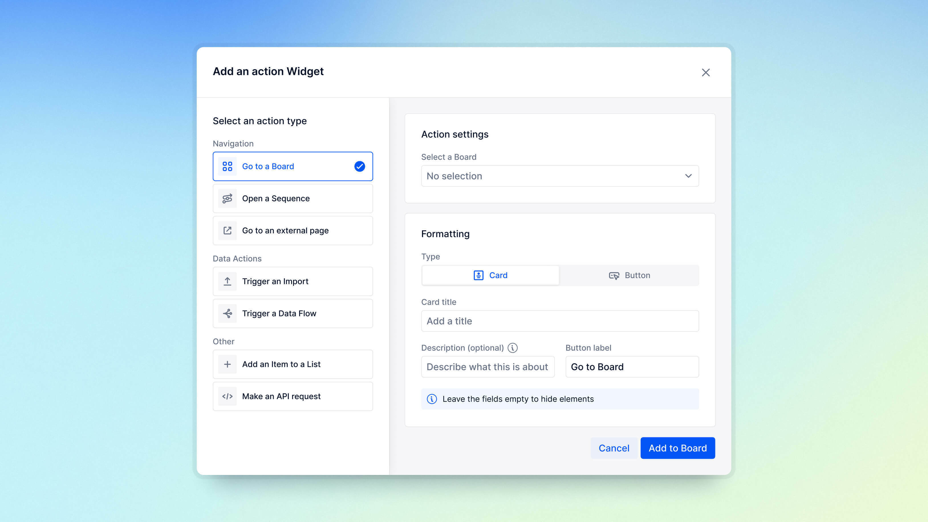
Action on selection
There are four different actions that can be performed when a Member selects an action widget. These actions are dependent on their access setup.
For example, if a Member does not have the Import Data permission, they can’t perform an import. They can’t see Boards they don’t have access to.
Link to another Board
Use this action button to allow users to navigate to another Board.
However, if a Member doesn’t have access to the Board, the button is grayed out with an message stating that they don’t have required access permissions for that Board.
Link to a Sequence
Use this Action widget to allow users to navigate to the start of a Sequence or a step within it. It can be displayed on the Board as either a Card or as a Button.
Sequences inherit Board-level permissions, requiring no additional settings. If a Member lacks permissions for specific steps, they can still access the Sequence and the restricted steps will remain visible but show a Page not found message. For more information on Sequences, see Create a Sequence for Input Flows.
Open an external link
Select this action button to open an external website link in a new window.
Trigger an import
You can set up a saved import configuration that automatically runs when a user selects this action button.
To do this, first select the Import option. This prompts you to choose the Block and the specific configuration for the import you want to run.
Start by selecting the Block you want to import data into. The menu lists all Blocks that have a saved import configuration available.
Next, choose the specific import configuration you want to use. This applies to both connectors and file imports. If this is a file import, selecting this action button prompts uses to provide the necessary file to complete the import process.
Add a List Item
Selecting this action button quickly adds an Item to a specified a Dimension or Transaction List, and automatically adds the new Item to the Page Selector.
To do this, first select a List where the new items will be added and then choose a View to define the fields for the item. The Add a List Item button can be displayed on the Board as either a Card or as a Button. Optionally, you can further customize the button by editing its title, description, or formatting in the Settings.
For more information, see Create an Add Item Action Button.
Display options for Action widgets
When setting up an Action widget, you can choose between two display types: cards and buttons. Cards offer more room for context with a description field and flexible options for orientation and alignment. On the other hand, buttons provide a more streamlined look and save space.
Card display options
When you first add an Action widget, you'll be prompted to enter a card title, description, and button label. Once the widget is added, you can select the settings icon to access more formatting options and customize it further.
-
Title. This bold text at the top of the card acts as a headline, giving a quick overview or title for the action.
-
Description. The description appears just below the title and offers extra details or context to help clarify the action.
-
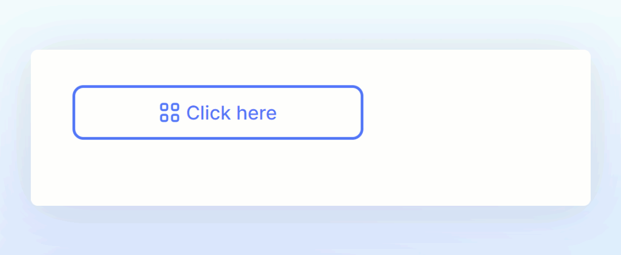
Button Label. The text entered here shows up on the button within the card. While the button usually triggers the action, selecting anywhere on the card launches it.
-
Orientation. There are two layout options available: horizontal and vertical. The orientation choice affects the order of elements within the card, including the icon, title, description, and button. In a vertical orientation, these elements are stacked on top of each other, while in a horizontal orientation, they are arranged side by side from left to right.
-
Alignment (Vertical Orientation Only). When using the vertical orientation, you can adjust the alignment of the icon, title, description, and button. You can choose between left justification or centering.
-
Background Color. By default, action cards have a white background. You can enable a background color and customize it. When a background color is applied, the text and button color automatically adjust to provide better visibility, ensuring there's enough contrast.
-
Card Background Color / Button Color. The name of this option changes depending on whether you've enabled a background color. If a background color is enabled, you can choose the color for the entire card. If not, you can adjust the color of the button. Note that you can't choose both the card background color and the button color simultaneously.
-
Icon. There are different icons depending on the Action on select that you choose. When the Go to another board action is used, the icon displayed will be the one assigned to the Board.
Button display options
You can customize the look of a button and adjust the action through the Action widget settings.
-
Go to the Board where the button is located.
-
Select Edit Board.
-
Hover over the button and select the Settings symbol.
-
Select Action.
Button label and tooltip
The button label controls what text will appear on the button, by default it will say Go to Board, Click here or Start an Import. There is no limit on the text of the label, however, buttons are limited to one line so its best to choose a small title.
You can add a tooltip that will appear when users hover their mouse over a button. This tooltip is limited to 150 characters.
Formatting options
There are two formatting options: Filled and Outlined. Filled uses a solid color, whereas Outlined shows a transparent background and allows you to choose the outline of the button. Depending on the option you choose, the color pickers icon and selected colors adjust accordingly. You can choose the color of the button or outline and the text. You can also bold or italicize the button's label.
Display icon
This toggle controls if the icon appears on the button, there are different icons depending on the Action on selection that you choose. When the Go to another board action is used, the icon displayed will be the one assigned to the Board.
Fit to text
This option determines the size of your button. If toggled off, the button size is determined by the overall size of the widget. If you choose this option, you can resize the widget and the button adjusts to fit the entire widget. To adjust the widget size, make sure the button settings are closed while keeping the Board in edit mode. Drag and drop to resize.

When you toggle on this option, the button resizes based on the text inside it. You can also choose where the button appears within the widget—left, right, or center—making it easy to position it just the way you like, especially if the widget is large and the button text is small.
How to add an Action widget to a Board
Users with the Configure Boards permission can add a button to a Board through the following steps.
-
Select Edit on the Board where you want to add a button.
-
Select + Add a Widget and select Action.
-
In the Type section, select the action you require.
-
Select either a Card or Button format for the Action button.
-
Complete the remaining text fields.
-
Drag and drop the button to its correct location on the Board.
-
(Optional) Select the Settings icon at the top right of the widget to update the button title and description or to edit its formatting.