


Map charts allow you to display geolocated data points using longitude and latitude data or standard regions like world countries, USA ZIP codes, or USA states.
They can be used to:
- Visualize and compare sales performance across different regions, states, or countries to identify high-performing areas and potential markets for growth.
- Provide clear insights into regional allocations to help sales teams optimize their strategy.
- Support supply chain performance by quickly identifying bottlenecks or inefficiencies in specific locations.
This guide outlines how to build and customize your Map chart.
Choose the appropriate Map chart
The Map chart has two main options:
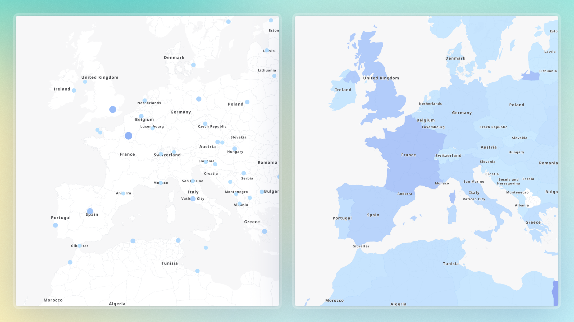
- Markers. Use markers to display information, such as accounts or suppliers, as points on the map.
- Areas. Use areas to display information, such as revenue or headcount across regions or countries, on the map. You can define areas by country, ZIP code, or state.
Configure a Map chart for markers
Use geolocated data points to configure a Map chart with markers. Markers are defined by latitude and longitude coordinates. They are used to represent locations, such as shops, manufacturing plants, or prospects.
Prepare the data set
You must create a Table to build a Map chart. To do this, prepare a data set that contains a minimum of:
- One Dimension. This is the primary Dimension that contains the Items you want to represent on the map, such as an Account or Supplier. To display markers, the latitude and longitude data can be modeled as Metrics or Properties of the primary Dimension.
- One Metric. This Metric contains the primary Dimension, like Account.
You can further customize your map using Metrics that contain the primary Dimension, like Account, to represent:
- Text or descriptive data to customize the map, like tooltips or marker labels.
- Number Metrics to customize the size or the colors of the markers. Additional Dimensions, like Month, can be included to adjust the data displayed through Page Selectors, such as Revenue per Month.
Arrange data in a Table
Before you configure the chart with markers, you must create a Table and ensure that:
- The primary Dimension is in rows (e.g., Account or Supplier).
- Optional Dimensions are in Pages.
- Metrics are in columns.
Create the Map chart for markers:
- Open the Table you created for your Map chart.
- Select Chart.
- In the Format panel, select Map chart (globe icon).
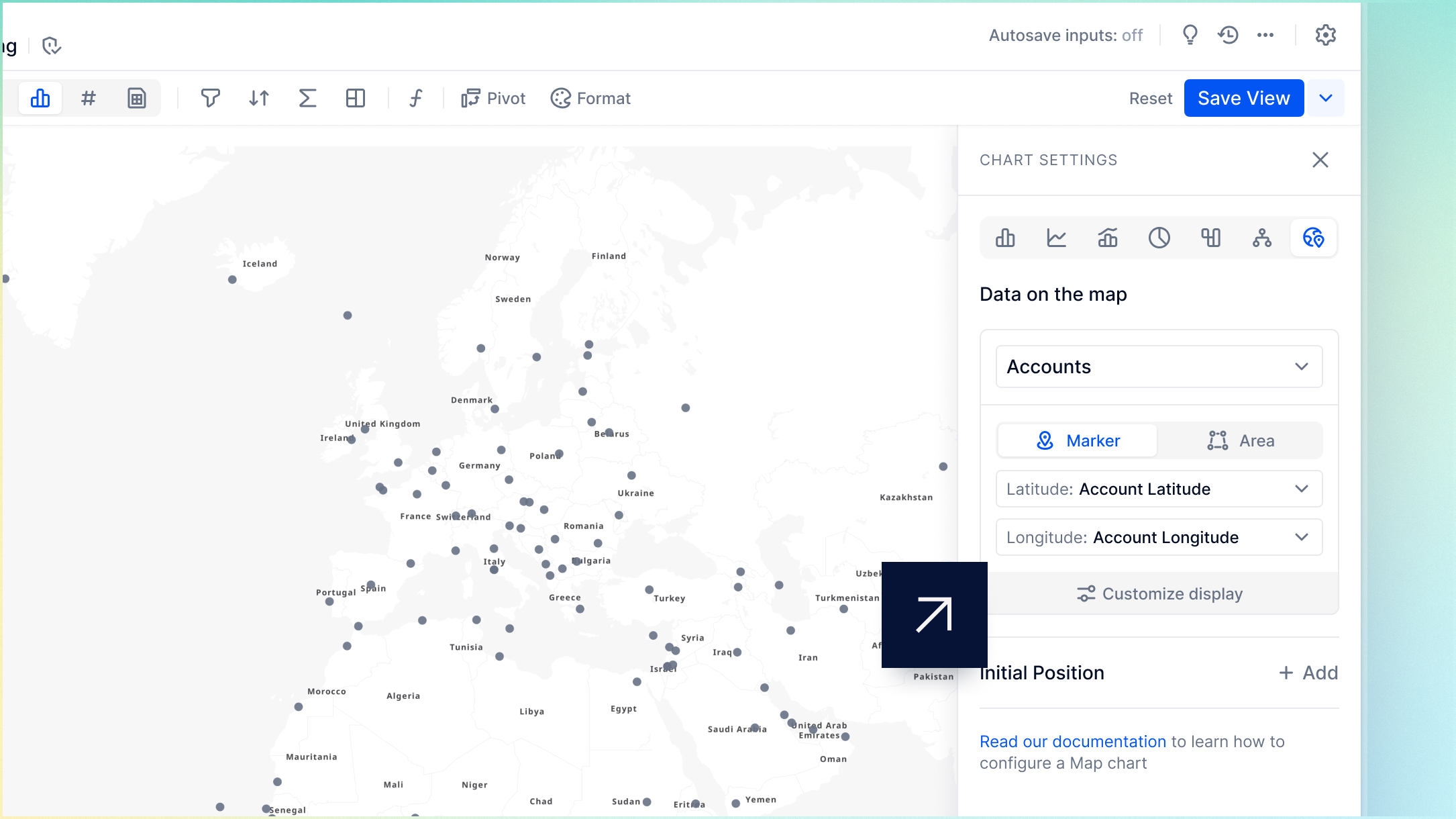
- Select the primary Dimension from the dropdown.
- Toggle on Marker in the Format panel.
- Select the source data for both the Latitude and Longitude from the dropdown.
- Select Customize display (optional) to customize your Map chart.
- Select Save View.
Configure a Map chart for areas
Use areas to display information, such as revenue or headcount across regions or countries, on the map. You can define areas by country, USA ZIP code, or USA state. These codes represent specific areas, such as entire countries, specific regions, or states.
Prepare the data set
You must create a Table to build a Map chart. To do this, prepare a data set that contains a minimum of:
- One Metric. This Metric contains the primary Dimension.
- One Dimension. This is the primary Dimension that contains the Items you want to represent on the map. This can be a Country code, USA ZIP code, or USA state code. Country, ZIP, or state codes can be modeled as a Metric or Property of the main Dimension.
Area codes must map to the Items in the ISO 3166-1 alpha-2 country codes, USA ZIP codes, or USA state codes CSV files to display areas on the map.
Arrange data in a Table
Before you configure the chart with areas, you must ensure that:
- The primary Dimension is in rows. This can be Country, ZIP code, or state.
- Optional Dimensions are in Pages.
- Metrics are in columns.
Create the Map chart for areas
- Open the Table you created for your Map chart.
- Select Chart.
- In the Format panel, select Map chart (globe symbol).
- Select the primary Dimension from the dropdown.
- Toggle on Area in the Format panel.
- In the Type section, select World countries, USA Zip codes, or USA States. Your Type selection must correspond to the data in your primary Dimension. This can be country, USA ZIP, or USA state codes.
- Select Add area data source and choose the Dimension property or Metric containing either country codes, USA ZIP codes, or USA state codes.
- Select Customize display (optional) to customize your Map chart.
- Select Save View.
Customize your Map chart
You can customize your Map chart in a number of ways to suit your data visualization needs. The following fields can be populated by Metrics in your Table or Dimension Properties of the primary Dimension.
In the Format Chart panel, click Customize display to access the following options:
| Setting | Description |
| Label | Labels are displayed below a marker or near an area. Select a source for marker or area labels from the dropdown. |
| Tooltip content | Tooltip content is used to define the content displayed in a tooltip when hovering over a marker or area. List properties of type Dimension can’t be displayed in tooltips and formatting applied to any Properties will not persist in the tooltip content. Use the dropdown to choose the source data to display when hovering over a marker or area for additional context. You can select multiple data sources to enhance your tooltips. When multiple sources are selected, the tooltip displays content sequentially without rich text formatting. Rich text formatting is supported in tooltip content when a single Metric or Property is used for tooltip content. For more information, see Rich text formatting options. |
| Cluster Markers | When there is a high density of markers on a Map chart, you can cluster them for better clarity. Cluster markers are only available for maps displaying markers and are toggled On by default. The number displayed indicates how many markers are within the cluster. |
| Marker Size | Marker Size is only available for maps displaying markers. You can display larger or smaller markers based on a numeric value, such as Quantity. Use the dropdown to select the data source, and the markers will scale relative to the values. |
| Dynamic Color | You can use Dynamic Color to customize the colors in your Map chart using Dimension Items colors, cell background colors, and cell text colors from the grid. |
Dynamic color
Select +Add Dynamic color and choose from the following options:
- Dimension Items: Use the Dimension Items color from the grid. Go to the Dimension block, click on Manage Items, and update the Item color property to customize these colors. You can only select List Properties and Metrics of Dimension type.
- Cell Background: Use the cell background colors from the grid Apply static or conditional formatting to the grid to customize these colors. By default, these are grey if no formatting has been applied.
- Cell Text: Use the cell text colors from the grid. Apply static or conditional formatting to the grid to customize these colors.
Initial position & Zoom level
You can set the Initial position and Zoom level of the Map to define where users first land and the magnification of the Map.
There are two types of Initial position available: Preset and Manual.
⚠️ Important
USA ZIP codes are visible from zoom level 6 and USA States are visible from zoom level 2.
Use a preset
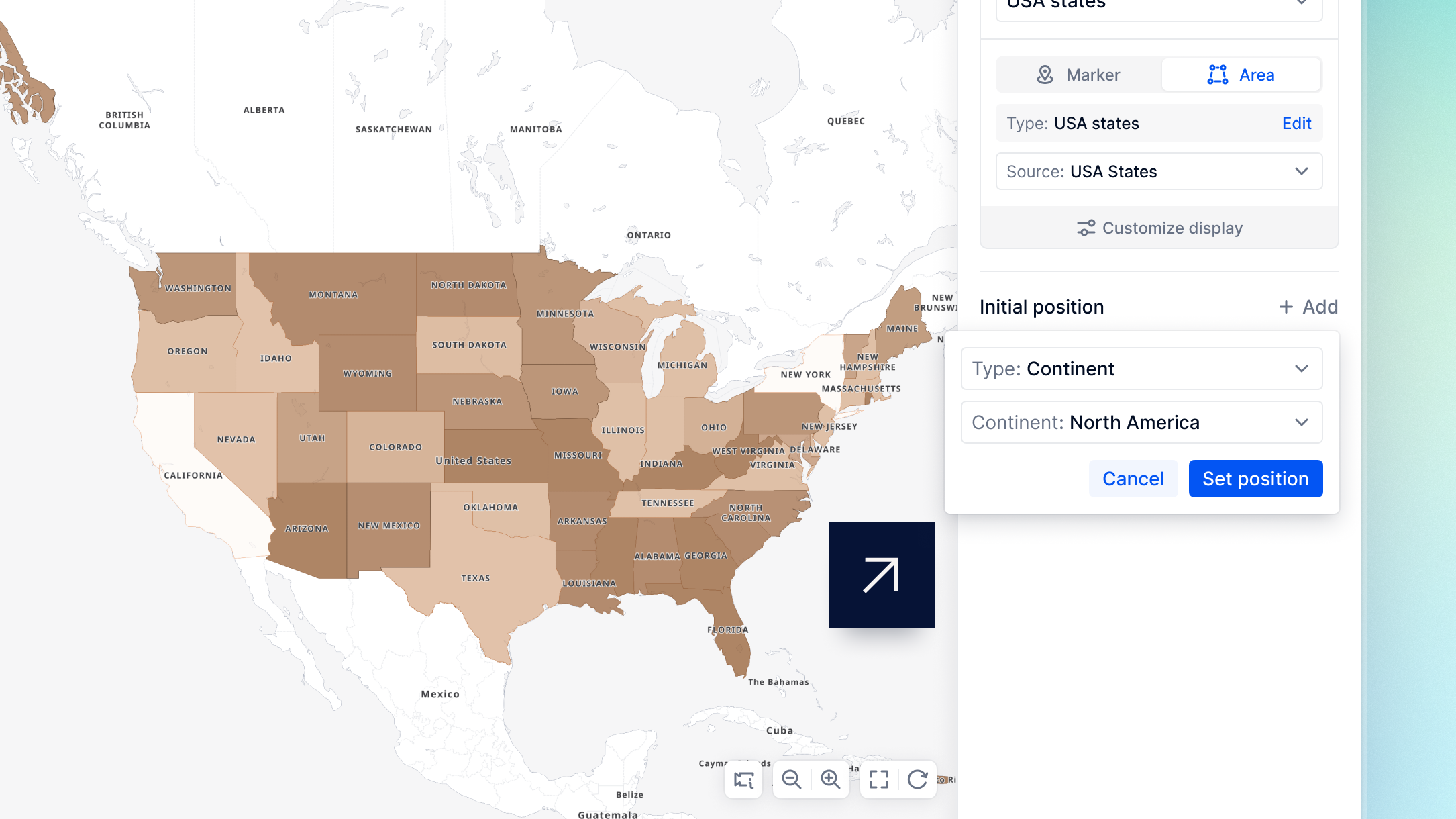
Use this setting to automatically set the Initial position to a specific continent or USA state.
To do this:
- Go to Initial position and select Add.
- Select Use a preset.
- In the Type dropdown menu, select Continent or USA state, then choose the specific continent or state you want to set as the Initial position.
- Select Set position.
- Adjust the latitude and longitude coordinates and the zoom level to refine the initial position, or choose a new preset using Use a position preset. A higher zoom number indicates a more magnified map.
- Select Save View.
Set manually
Use this setting to manually define the Initial position using latitude and longitude coordinates.
ℹ️ Note
You can select Position details (camera symbol) in the bottom-right corner of a map to view your current coordinates and zoom level.
To do this:
- Go to Initial position and select Add.
- Select Set manually.
- Enter the latitude and longitude coordinates to define the area on the map to set as the Initial position.
- Adjust the Zoom level slider to set the default zoom for users. A higher number indicates a more magnified map.
- Select Save View.
Download CSV files
Download the ISO 3166-1 alpha-2 country codes, USA Zip codes, or ISO 3166-2 state codes CSV file below.